

by Millicent Elekwachi.
Founder
truespringresources.com
As a first-time author, your attention is usually fixed on the manuscript itself: the story, the language, and whether the book works on the page. Once the writing is complete, a different responsibility begins. The book now has to exist in the world, and this is where many self-publishing mistakes happen.
You may also be at an earlier stage, with a strong idea for a book and a desire to understand the process before committing fully.
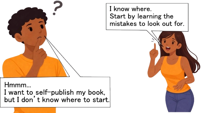
If either describes you, this guide is for you.
Below is a list of 13 self-publishing mistakes every first-time author should watch out for. Some come from my early professional experience. Others are strong opinions grounded in industry patterns and research.
The guide is organized into four categories: book design mistakes, production mistakes, pricing mistakes and others.
It’s a long but practical read. Take your time, you can always come back.
Book Design Mistakes
1. Not Aligning Your Cover with Genre Conventions
When designing a book cover, it’s important to consider the visual conventions of your genre. This isn’t exactly a stated law, but it is practical. Genre alignment helps readers immediately understand what your book is, who it’s for, and whether it fits what they are looking to read. A cover exists to communicate clearly with the reader.
Why this matters
Readers often make snap judgments about a book, sometimes in fractions of a second. Familiar visual cues such as colors, layouts, illustration styles, and typography act as a visual language, allowing readers to recognize the category and purpose quickly.
When a cover aligns with these conventions, it reduces effort and encourages engagement. Misaligned covers, even if the book is well written, can repel the intended audience simply by sending confusing signals. Genre conventions can also change with time. Earlier in my career, Nigerian story books commonly followed a visual style that is rarely seen today.


Readers scan for cues
Audiences learn patterns from experience. Young children respond to bright colors and simple imagery; teens browsing fantasy expect dramatic compositions or symbolic elements; adult readers of mystery anticipate moody tones and deliberate typography. Covers that match these expectations invite a pause, giving readers a chance to engage with the book.
How to approach genre alignment thoughtfully
Start with observation, not imitation. Study successful books in your genre, noting recurring choices in color, font, imagery, and mood. This doesn’t mean copying. Understanding the visual vocabulary allows you to communicate clearly. Creative departures are possible, but they work best when rules are understood and broken intentionally.
The principle
Use genre conventions as guidance. Clear visual communication respects the reader’s time and increases the chance they’ll pick up the book.
2. Improper Visual Hierarchy: When Main Elements Are Not Emphasized
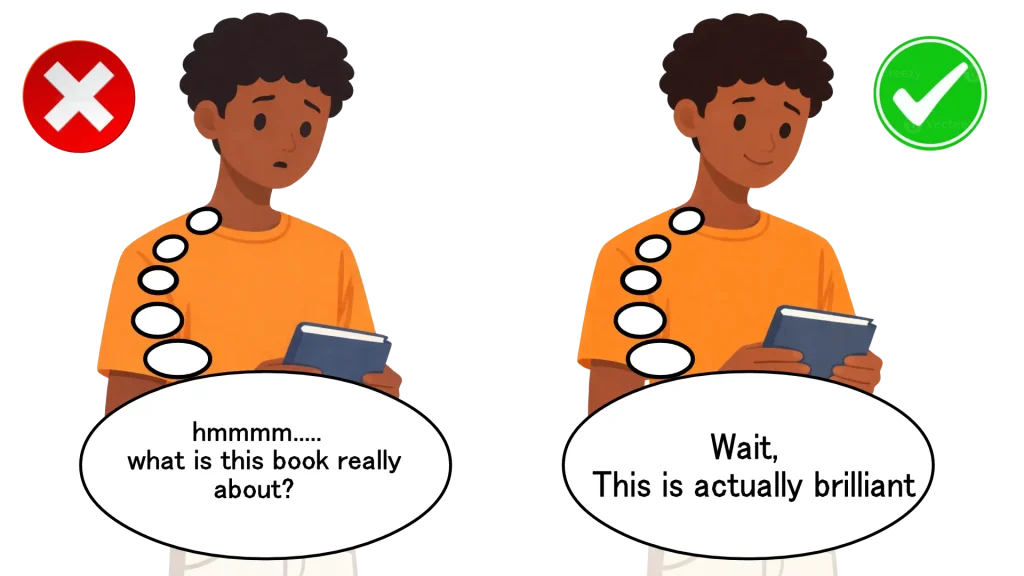
A common cover design mistake is failing to establish a clear visual hierarchy, this design mistakeeven matters more when your book serves a younger audience. Authors include many important story elements but give none clear priority. As a result, the main character or key object competes with secondary details, leaving readers unsure what the book is about.
A cover is not meant to explain everything. Its responsibility is to introduce what matters most, clearly and immediately.
Why this matters
Most book discovery happens quickly and at small sizes. Readers scroll through online stores where covers appear as thumbnails. In that environment, clarity matters more than completeness. Visual hierarchy tells the reader where to look first and what to understand without effort.
When hierarchy is weak, even a well-illustrated cover fails to communicate.
Readers’ eyes do not know where to land
Every effective cover has a clear focal point which is either a singular, striking image or a large, bold title. This is the element the eye lands on first, naturally and without instruction.
When multiple elements are treated as equally important, the eye jumps between them. Nothing feels central. At full size, the cover may look detailed and impressive. At thumbnail size, it becomes crowded and difficult to read.
You dont have much time to earn attention
Even in a brief glance, readers try to figure out what a book is about. If your cover lacks clear visual hierarchy, that effort becomes confusing or frustrating. A well-structured cover makes understanding almost instantaneous.
When everything is important, nothing stands out
Covers that attempt to represent multiple plot points at the same visual level often feel unfocused. Readers struggle to understand what the book is really about, and the cover signals inexperience even when the artwork itself is strong.
A practical example from my experience
I learned this lesson while working on Udodi and the Mystery Book. On the cover, Udodi, the protagonist, appears in the background riding a blue pegasus. The mystery book he holds is small and difficult to identify, while two secondary characters dominate the foreground.

If I were designing it today, Udodi and the mystery book would be central and larger, with supporting elements clearly secondary. The story would remain the same. Only the visual priorities would change.
How to avoid this mistake
Identify a single primary focal point. Choose the protagonist or key object that best represents the book’s core (it could be symbolic as well ‘twilight‘). Make it visually dominant.
Then apply the thumbnail test.This mirrors how covers are evaluated in Amazon search results, where clarity at thumbnail size determines whether a reader clicks or scrolls past. If the main element is not immediately recognizable, simplify and adjust.
Seek feedback from people unfamiliar with the story.
The principle
A book cover must communicate its essence. Proper visual hierarchy makes that possible.
3. Treating Cover Design as a Last-Minute Task
Reaching the end of the writing and editing process often creates a sense of urgency to publish. In that rush, cover design is reduced to a task to be completed rather than a decision to be considered carefully. When this happens, concepts are chosen too quickly, execution suffers, and preventable design problems make their way onto the final cover.
A cover is not decoration. It is part of how the book speaks to readers before a single page is read. Treating it as an afterthought undermines the care invested in the manuscript itself.
Why this matters
Strong covers are rarely accidental. They are the result of research, iteration, and thoughtful distance from the manuscript. When design is rushed, authors tend to default to literal scenes, obvious imagery, or generic visuals that feel safe but fail to communicate clearly.
In crowded marketplaces, especially online bookstores (study on book cover impact on online sales), that difference is critical. Readers make decisions quickly. A rushed cover often fails to signal genre, tone, or quality clearly enough to earn a second look.
How to avoid this mistake
Plan for your cover early, even if the final design comes later. Study successful books in your genre well before release. understand what your cover needs to communicate, not which scenes you personally want to depict.
The principle
Your cover deserves the same intentionality as your writing. When you rush the cover, you rush the reader’s first impression. First impressions are part of stewardship, and they are rarely forgiving.
4. Ignoring Proper Interior Formatting
Interior formatting is how your book actually lives on the page. It includes font choices, margins, spacing, page numbers, headings, and layout conventions. Many first-time authors invest heavily in cover design but treat the interior as a technical afterthought. The result is often a book that looks unfinished the moment a reader opens it.
A compelling cover may earn initial interest. Interior formatting determines whether the reading experience feels trustworthy and comfortable enough to continue.
Why this matters
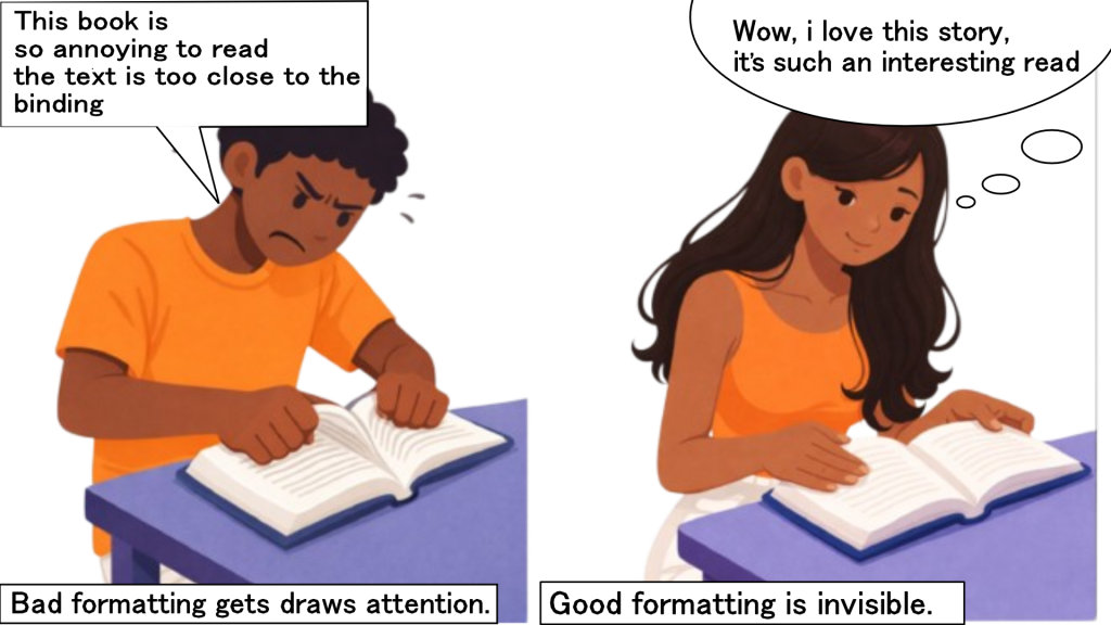
Good formatting does its job quietly. Readers rarely notice it because nothing interrupts their focus. They move from page to page without friction. Bad formatting, on the other hand, announces itself immediately. Tight margins strain the eyes, inconsistent spacing disrupts reading rhythm, and inappropriate fonts feel distracting or juvenile. These issues break immersion and subtly lower confidence in the work as a whole. In other words, “Good formatting is invisible, while bad formatting draws attention.”
Formatting also affects credibility. Poor interior design can often be read as inexperience, even when the writing itself is strong (this can make your readers hesitate to recommend your book). Presentation shapes perception. The book feels less authoritative, less serious, and less worth the reader’s time.
What proper interior formatting includes
Consistent font use
Choose one font for body text and commit to it. If you use a separate font for chapter titles, apply it consistently throughout the book. Variations are acceptable when they serve a clear narrative purpose, such as letters or diary entries, but they should be applied consistently within that category.
Avoid default document fonts like Calibri or Arial. They resemble office documents rather than books. Traditional fiction often uses fonts such as Garamond, Baskerville, or Caslon (best fonts for books). Most nonfiction benefits from clean, readable serif fonts designed for long-form reading.
Proper margins and gutters
Margins are functional before they are aesthetic. Readers need sufficient white space so text does not feel cramped. Print books require extra space on the inner margin, known as the gutter, to account for binding.
If text sits too close to the spine, readers must force the book open to read it, causing discomfort and damaging the book over time. Typical print margins allow more space on the inside edge than the outside to accommodate binding.
Clear visual hierarchy
Chapter titles should be the most prominent elements. Subheadings should be clearly distinct from body text, and body text should remain consistent throughout.
If Chapter One begins with a bold, centered title at a specific size, every chapter should follow that same structure. Random shifts in size, weight, or alignment confuse readers and weaken cohesion.
Standard spacing practices
Most professionally formatted books use first-line indents with no extra space between paragraphs. Extra paragraph spacing is common in documents and online writing but uncommon in printed books. Line spacing should be consistent and comfortable.
How to get formatting right
If you format the book yourself, use templates designed specifically for books and matched to your trim size. Word processors default to document settings, not publishing standards.
Always order a physical proof copy before publishing. Formatting that looks acceptable on screen often reveals problems in print.
When possible, hire a professional formatter.
The principle
Interior formatting is a form of reader care. When it is done well, it disappears. When it is done poorly, it interrupts reading and signals inexperience.
5. Choosing Binding Thoughtlessly Instead of Strategically
Binding is often treated as a purely technical decision. Many self published authors choose it based only on cost, assuming readers will judge the book solely by its content. This overlooks how much meaning binding carries before a single page is read.
Binding tells readers what kind of book they are holding, how it is meant to be used, and how seriously it should be taken.
Why this matters
A book is both text and object. Readers interpret physical cues instinctively. Binding communicates genre, quality, and intent. When those signals align with expectations, readers feel oriented. When they do not, readers feel hesitation, even if they cannot explain why.
Choosing binding thoughtfully is part of respecting the reader’s experience.
Binding sends immediate quality signals
Before a reader opens your book, binding has already shaped their expectations.
Literary fiction, memoirs, and most nonfiction are typically presented as perfect bound paperbacks or hardcovers. These bindings suggest sustained reading and narrative depth. Spiral binding usually signals practical use, such as workbooks, planners, and cookbooks. Case binding often communicates durability and long term value.
When binding does not match these conventions and there is no clear reason, the book can feel misclassified or unfinished. The issue is not the binding itself, but the lack of intentional alignment.
Thoughtless binding confuses readers
Imagine a serious novel presented in spiral binding with no narrative justification. It feels off because the physical form contradicts the content. Readers may hesitate before even opening the book.
At the same time, unconventional binding can work when it is purposeful. A novel structured as student journal entries could benefit from spiral binding that evokes notebooks. A story framed as collected research notes might feel more authentic with a nontraditional format. In such cases, binding becomes part of the storytelling.
The distinction is intention. Accidental unconventional binding appears careless. Intentional unconventional binding, supported by concept, can be effective.
Wrong binding also fails functionally
Binding affects how a book performs in use. Thick books held together only with glue are prone to spine damage. Readers expect durability from longer works. Spiral binding allows books to lay flat, which is ideal for hands on use. Saddle stitching works for very thin books but fails as page count increases.
When binding does not support how the book is meant to be used, readers experience frustration.
How to choose book binding more wisely
For traditional genres such as fiction, romance, thrillers, and business books, perfect binding or case binding remains the most appropriate choice. Deviating without a clear creative reason can signal inexperience.
For functional books like workbooks or cookbooks, spiral binding supports use. Very thin books suit saddle stitching. Very thick books require stronger construction.
The principle
Choose a binding that matches reader expectations or intentionally challenges them in service of the story. Make the choice deliberate. Your book’s first impression depends on it.
6. Using Generic Stock Photos or Clip Art Without Customization
Stock images are easy to access and relatively affordable, which is why many first-time authors assume that purchasing one automatically makes their cover unique. In reality, stock imagery is licensed, not owned. Using popular, unmodified stock photos or clip art often results in covers that feel generic and interchangeable.
The issue is not the use of stock imagery itself. The issue is using it without intention.
Why this matters
Your cover may not be unique at all
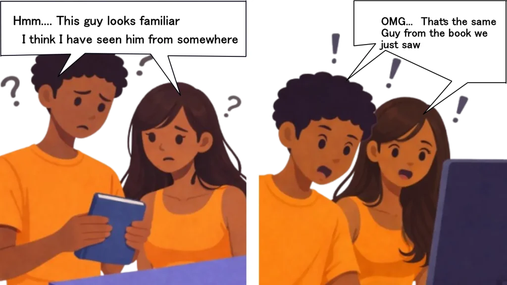
Most stock images are licensed to multiple buyers simultaneously. There is nothing stopping another author from using the exact same image on their book cover which weakens the cover’s ability to distinguish your book.
There are well-documented cases of unrelated books appearing with identical covers because they used the same widely licensed stock photo (source). This isn’t a copyright issue, it’s the natural result of using non-exclusive imagery. When you license a stock image, you aren’t buying ownership; you’re buying permission to use an image that others may also use.
Duplicate imagery damages trust
Shared cover imagery creates confusion. A reader searching for your book may encounter another title with the same image and hesitate, unsure which one they have found. That moment of uncertainty is often enough to lose a sale.
Repeated imagery can also harm credibility. Readers may assume imitation or lack of care, even when the author acted legally. The damage is perceptual, not technical. A cover that looks borrowed weakens confidence in the work behind it.
Your image may appear in unrelated contexts
Stock images circulate widely. The same image used on your cover may later appear in advertisements, websites, or materials unrelated to your book. You have no control over where else it appears or what it comes to represent.
Over time, this can dilute your book’s identity and create unintended associations.
How to avoid this mistake
Stock imagery can be used responsibly when handled with skill. Professional designers rarely place unmodified stock photos directly onto covers. They crop, recolor, layer, and combine elements so the final image feels original. Many traditionally published covers rely on stock imagery, but it is transformed beyond recognition.
Before committing to an image, run a reverse image search. If it already appears on multiple book covers, choose another option. Consider lesser-known stock libraries, illustration platforms, or commissioning custom artwork when possible.
The principle
Stock images are tools, not finished solutions. Used carelessly, they make your book forgettable. Used thoughtfully, they support a clear and trustworthy visual identity. Your cover should belong to your book alone.
Pro Tip: Planning for Series and Collection Consistency
When planning a book series or collection, successful authors think beyond a single cover. They establish a consistent visual system so every volume is immediately recognizable as part of a whole. At the same time, they ensure the design style matches the type of book being published. These two decisions work together and shape how readers perceive quality and intention.
Why this matters
Readers rely on visual signals to orient themselves. Just as consistency helps them recognize continuity, an appropriate design helps them understand purpose.
Series books must fit together visually
Books in a series should look related at first glance. Fonts, title placement, layout structure, and overall style should remain consistent across volumes. The Magic Tree House series provides a clear example.
When Book One and Book Two sit side by side, they should clearly show that they belong to the same family.
Readers collect series and display them
Series readers often collect every installment. They enjoy seeing the books lined up on a shelf. When covers share visual structure, such as consistent typography and thoughtful color progression, the collection feels intentional and premium.
Inconsistent covers suggest the series was not planned in advance. That impression quietly lowers perceived quality.
How to do this
Understand that the first book sets the template
If you plan multiple books, design the first with future volumes in mind. Choose elements that can scale across a trilogy or longer series while still allowing each book its own identity.
Work with designers to think beyond one cover. Rebranding midway through a series is costly and avoidable.
The principle
If you’re writing a series, design Book 1 with the entire collection in mind. Consistent visual branding helps readers recognize new releases and display their collection proudly.
Production Mistakes
7. Making Changes After Committing to Bulk Offset Printing
As a first-time author, it’s important to understand how offset printing works before committing to a large print run. Offset or plate printing has a high setup cost because printing plates must be created, but once those plates are in place, it becomes far more cost-effective per copy at higher volumes.
Because of this setup process, offset printing is not designed for frequent changes or last-minute revisions. After plates have been created, even small edits such as fixing typos or adjusting text require new plates, which increases costs and delays production.
For this reason, offset printing works best when your book files are fully finalized and thoroughly reviewed before production begins.
This mistake mainly affects authors who:
- Print 1,000–5,000+ copies
- Use offset printers locally or internationally
- Need bulk copies for events, schools, or distribution
How to avoid this mistake
Finalize everything before approving plates. Order and review a physical proof, triple-check your files, and get final sign-off from all collaborators. Ask your printer directly whether changes are still allowed before plate creation.
The principle
Digital printing forgives changes. Offset printing does not.
If you’re printing in bulk, treat plate approval as final.
8. Publishing Without Ordering a Physical Proof
As a first time author, please do not make the mistake of skipping ordering a physical proof copy before publishing, simply because it looks good on screen.
Why this backfires
Screens change how you read—and what you miss
Research in cognitive psychology consistently shows that people read differently on screens than on paper (source). This phenomenon—often called the screen inferiority effect—means screen readers tend to scan rather than read deeply, skim for keywords, jump around the page, and process information more shallowly.
When reviewing your manuscript on a screen, you’re more likely to:
- Auto-correct mistakes in your head
- Read what you expect to see instead of what’s actually written
- Miss typos, awkward phrasing, and formatting issues
- Overlook errors that would be obvious on paper
This is why professional publishers review physical proofs. No matter how many digital reviews are done, print still reveals problems screens hide.
How to avoid this mistake
Always order a physical proof before launch.. Treat this as essential quality control. Read the book cover-to-cover like a reader, not an editor, and mark anything that feels off.
The principle
Your book will live in readers’ hands, not on your screen. Review it in the format that matters. Catch mistakes privately in a proof, not publicly in reviews.
9. Choosing Offset Printing for Small Print Runs
First-time authors often assume offset printing is automatically cheaper because it’s the “bulk” printing method. As a result, they order small runs of 200–300 copies expecting to save money.

Why this backfires
Offset printing requires creating metal plates and setting up large presses. These setup costs are fixed, meaning they don’t change whether you print 200 copies or 2,000. When spread over a small number of books, the cost per copy becomes unnecessarily high.
Many local printers only achieve cost efficiency with offset printing at 1,000 copies or more. Below that level, digital printing is not just preferable, it’s usually the only sensible financial choice.
- Digital printing: Ideal for 50–1,000 copies. No setup fees, flexible, and easy to revise.
- Offset printing: Best for 1,000+ copies. High setup costs, but lower per-unit pricing at scale.
How to avoid this mistake
For a first print run, start with digital printing. Print a smaller batch, test demand, gather feedback, and make improvements. Once your book is validated and demand is clear, move to offset printing for larger reprints.
The principle
Offset printing is powerful, but only at scale.
Pricing Mistakes
10. Underpricing Your Book for “Competitive Advantage”
The mistake authors make
Some authors assume readers will choose their book simply because it is cheaper than others in the same category. In an attempt to attract more buyers, they price their work far below genre norms, believing affordability alone will drive sales.
Why this backfires
In publishing, price is not just a number. It is a signal.
When readers browse books online, they cannot assess quality in advance. They cannot read the full manuscript, evaluate editing quality, or judge depth of thinking. So they rely on signals. One of the strongest signals is price.
If a thriller ebook is priced at $0.99 while similar titles in the category sit at $3.99 or $4.99, many readers do not think they have found a bargain. Instead, they wonder what is wrong. Is it poorly edited? Is the writing weak? Was it rushed?
This response is not emotional. It is psychological.
Data from platforms like Smashwords has shown that books priced around $3.99 often outsell books priced at $0.99. Lower pricing does not automatically increase trust or demand. In some cases, it reduces both.
This behavior aligns with a well-known economic idea often described as the “market for lemons.” When buyers cannot judge quality before purchase, they assume price reflects information the seller has. A significantly low price suggests the seller knows the product is inferior and is trying to compensate.
Applied to books, underpricing can quietly communicate a lack of confidence in your own work.
How to avoid this mistake
Price your book within the normal range of your genre. Study the top ten books in your specific category, not publishing in general. Aim to price within 10 to 15 percent of the average.
For example, if romance ebooks in your category sell between $3.99 and $4.99, stay in that range. If business paperbacks typically sell for $14.99 to $16.99, price accordingly.
Compete on clarity, editing quality, presentation, and reader trust. Not being the cheapest option available.
The principle
Pricing is part of positioning. A price that aligns with your genre tells readers your book belongs. Quality is communicated before the first page is read.
OTHER MISTAKES
11. Not Setting Realistic Expectations About Self-Publishing
What happens
You finish your book and expect immediate bestseller status, thousands of sales in the first month, or viral social media buzz. When reality doesn’t match these expectations, you feel discouraged and give up.
Why realistic expectations matter
Most debut books sell slowly, and that’s normal
The average self-published book sells fewer than 250 copies (source) in its lifetime. This isn’t because those books are bad, it’s because building an audience takes time. Even excellent books need marketing, reviews, word-of-mouth momentum, and often a second or third book before sales pick up significantly.
Success is more like a marathon rather than a sprint
Authors who succeed long-term understand that their first book is the beginning of a career, not the end goal. It builds your author platform, teaches you the publishing process, and starts attracting your core readership. Your second book sells better than your first. Your third book benefits from having two previous books. By book five or six, you should have a catalog that generates consistent income.
The overnight success myth
When you see bestselling authors, you’re usually seeing years of behind-the-scenes work, multiple books, consistent marketing, platform building, networking, and often several “failed” launches before their breakthrough. Social media highlights success stories but hides the thousands of authors steadily building careers one reader at a time.
How to set realistic expectations:
Plan for your first book to be a learning experience rather than a retirement fund. Set modest sales goals, maybe 150 copies in the first year. Focus on getting honest reviews, and connecting with readers. Commit to writing multiple books. Celebrate small wins, every reader who finishes and enjoys your book matters.
Success in self-publishing comes from persistence, not perfection. Adjust your expectations, and you’ll enjoy the journey more.
12. Dodging Feedback Because It Hurts
One of the most damaging habits an author can develop is avoiding feedback. Some writers never ask for it. Others ask, then dismiss what they hear because it feels uncomfortable or personal. The intention is self protection. The result does more harm than good
Why this matters
Writing is intimate work. But publishing is a public act. The gap between those two realities is where feedback belongs. Feedback is part of quality control before release, it allows you to strengthen the book before readers encounter it without mercy or context.
You stay blind to obvious problems
Authors are too close to their own work to see everything clearly, which is normal but this often leads to Issues such as plot gaps or repetitive content that feel invisible from the inside.
Fear keeps you stuck, not safe
Writers often struggle with self doubt and fear of judgment. That fear often shows up as reluctance to share work.
But avoiding feedback does not prevent criticism. It only delays it. The difference is timing. Feedback before publication is private and constructive. Criticism after publication is public and permanent.
One improves the book. The other defines how it is received.
How to approach feedback well
Seek feedback early, not when the book feels untouchable. Join a writing group, work with a developmental editor, or share drafts with thoughtful readers. Understand that friends and family may struggle to be fully honest.
When criticism comes, assume good intent. Most people offering feedback want the work to succeed. Receive it with humility. Evaluate it carefully. Apply what strengthens the book.
The principle:
Avoiding feedback does not protect your book. It guarantees its weaknesses reach readers unfixed. Thoughtful criticism is a form of care. Accept it, and let the work grow stronger before it is seen.
CONCLUSION
Self-publishing offers freedom, but it also transfers responsibility. Every decision traditionally handled by a publisher now rests with the author. That reality is neither good nor bad on its own. It simply demands intention.
Most of the mistakes outlined in this guide are not caused by laziness or lack of talent. They come from rushing, from fatigue, or from underestimating how readers actually experience books. Covers that confuse, formatting that distracts, pricing that undermines trust, or production choices made without strategy all weaken a book before its content has a fair chance to speak.
The encouraging truth is that these mistakes are avoidable. None require extraordinary resources. They require awareness, patience, and respect for the reader’s experience. Strong books are rarely the result of doing more. They are the result of doing the essential things well.
If there is one principle to carry forward, it is this: publishing is communication. Every design choice, production decision, and price point tells the reader something before they read a single word. When those signals align with the quality of your work, your book stands on solid ground.
Take your time. Plan deliberately. Finish with care.
Your book deserves it, and so do your readers.